Transforming Seafood Company into Consumer Brand: KnowSeafood + Phoode Case Study
KnowSeafood hired Phoode to revamp their seafood branding photography to align with their new brand identity and website design. The project encompassed various types of images, such as individual and group product photos, website banners, recipes, and lifestyle shots.
The KnowSeafood founder aimed to shift the perception of KnowSeafood from a seafood company to a consumer brand. To achieve this, they adopted a multi-faceted approach that prioritized developing a cohesive visual and verbal identity, which communicated the brand’s values, mission, and unique selling proposition. The brand’s founder stated:
“We don’t want to be branded as a SEAFOOD COMPANY (…) we want to be unique”.
The vibe was to set out on our journey with calm seas and clear skies, using an airy blue as the foundation of the brand. It is bright and warm. It evokes seafood, but with a twist, and allows for our bold unexpected colors to bring the playfulness of the brand to life.
The brand identified its target audience and developed a unique value proposition that highlighted its commitment to delivering sustainable, high-quality seafood directly to consumers. Their brand name, KnowSeafood, aligned with their value proposition and a tagline, “Know What You Eat,” that reinforced the brand’s focus on transparency and education.
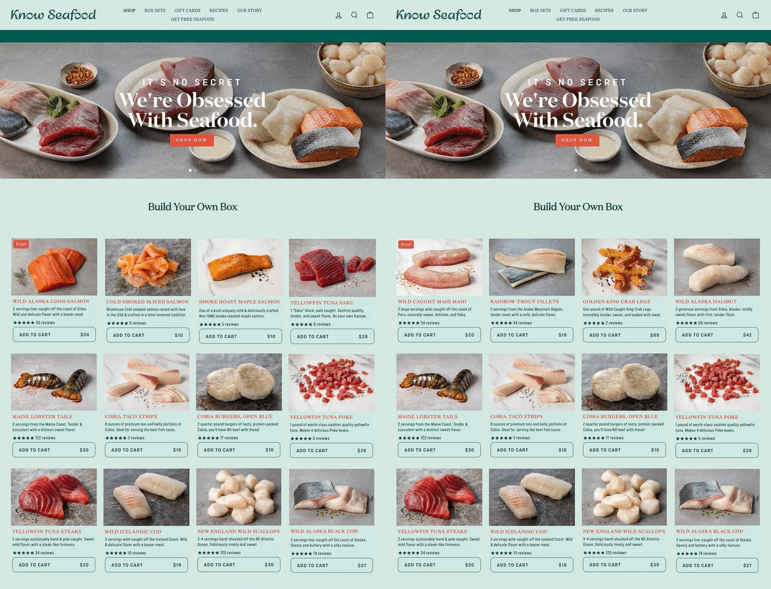
The brand’s story focused on its commitment to sustainability, traceability, and transparency, and emphasized the brand’s role in helping consumers make informed decisions about the seafood they eat and using blockchain to track seafood origin.
“Drawing on their passion, deep experience, and connections in the seafood industry, Dan and Paul founded KnowSeafood to use transparency and traceability to bring trusted quality seafood to a broader range of people.”
The brand wanted to be perceived as premium but with personality at the same time. Not as serious and boring as traditional seafood companies.
“At KnowSeafood, we don’t take ourselves too seriously, but we are serious about seafood. (…) Our KnowBuddies (that’s you) deserve the best. So join the family and savor reel-good, sustainable seafood that makes every meal at home memorable!”
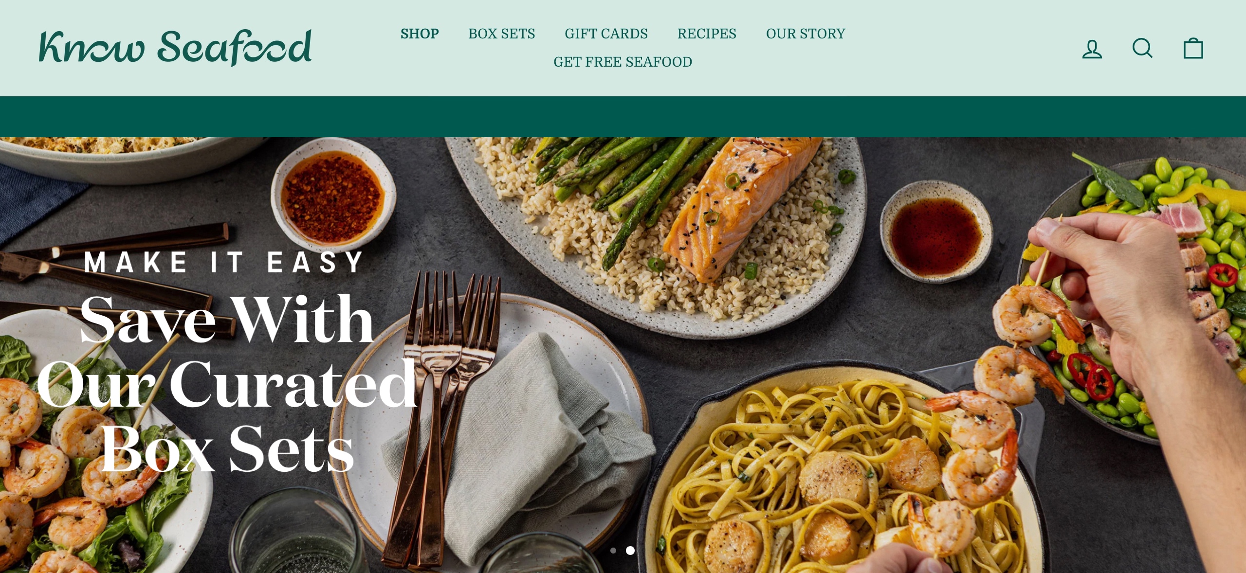
All that required a new visual identity that was consistent with its values and mission. They created a brand new logo that featured an abstract representation of a seafood world and used an ocean blue and green color palette to evoke a sense of freshness and sustainability. The brand’s website and social media profiles feature visuals, engaging copy, and educational content that highlights the brand’s commitment to sustainability and transparency.
“While there are plenty of fish in the sea, we make sure you get only the best delivered to your door. Stop by our virtual “counter” and shop all your gilled and shelled favorites. Salmon. Scallops. Lobster. You name it, we’ll net it. We might even throw in a new one for you! (…) And while we can’t promise you’ll know each flounder’s name, we do promise happy taste buds—and zero fishy origins. In fact, we’ll tell you exactly where your catch came from. You can thank our blockchain technology for that (told you we were serious about seafood!)”
Phoode was engaged to develop a fresh appearance for seafood branding photography, which would align with the new visual identity of KnowSeafood brand and appeal to its target audience.
Phoode’s “creative food officer” a.k.a. Food Polka engaged six different “food creatives” from the Phoode network in the Los Angeles area to complete this project.
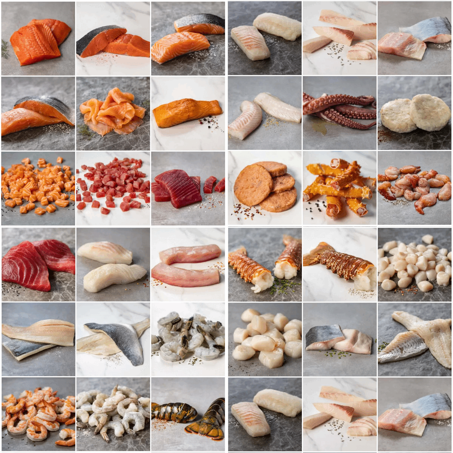
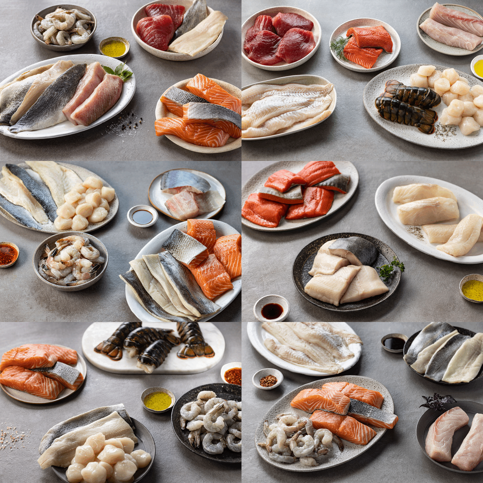
Individual Product Shots
The previous photographs of the products were of poor quality, with blurry images and an overhead angle that gave the seafood a flat appearance. Furthermore, the styling was inadequate, and the presence of distracting props made the overall presentation cluttered. As a result, the images failed to showcase the products in an appealing and enticing manner to the senses.
Phoode’s art director recommended deviating from the previous approach and instead emphasizing the quality and freshness of the seafood. We aimed to showcase the inherent allure of raw seafood by emphasizing its texture, color, and shine.
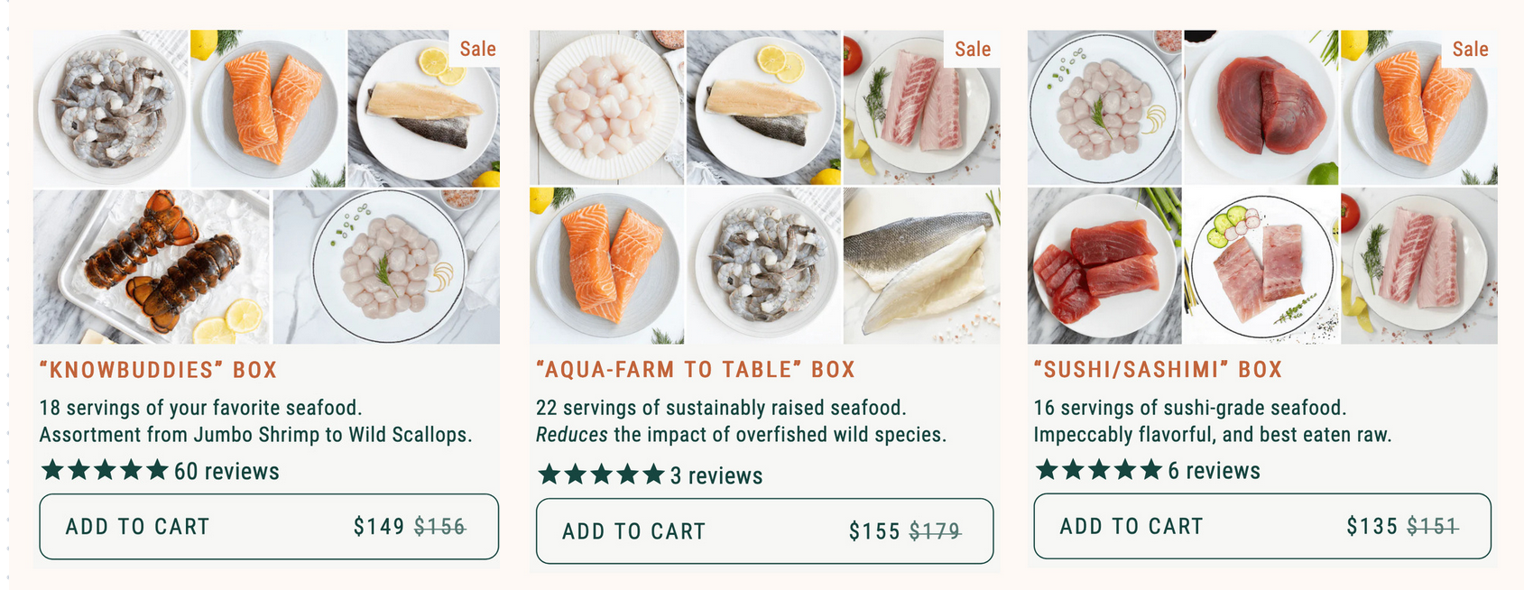
To showcase the seafood’s exceptional quality, Phoode advised using selective focus, and backlighting techniques to bring out the textures, colors, and shapes of the product. The suggested background was organic, gray-toned stone surfaces with only minimal food props. We didn’t use any kitchen props. Only selected spices, condiments, and tiny sprigs or herbs that naturally complement each seafood species were used as accents. No overwhelming bunches of herbs or pieces of food garnish.
Our goal was to let the product’s natural beauty shine through. Although seafood may not always be photogenic, it took a lot of food stylists’ effort to shape, bend and prop each product to bring out its true beauty. Food photographer Ricardo Mora helped out by employing a range of lighting modifiers, and fill cards.
The group product shots – Curated Boxes
The curated boxes are the brand’s signature product collections. Each consists of a combination of six different seafood products.
To showcase the content of curated seafood boxes, the creative director opted for an abstract and buffet-like arrangement, moving away from the typical kitchen setting. The backdrop for capturing product shots remained the grey-toned stone surface, but it was enhanced with the inclusion of simple serving pieces like stone boards and handmade ceramic props in organic shapes and complementary colors that harmonize with the brand’s ocean blue-green tones.
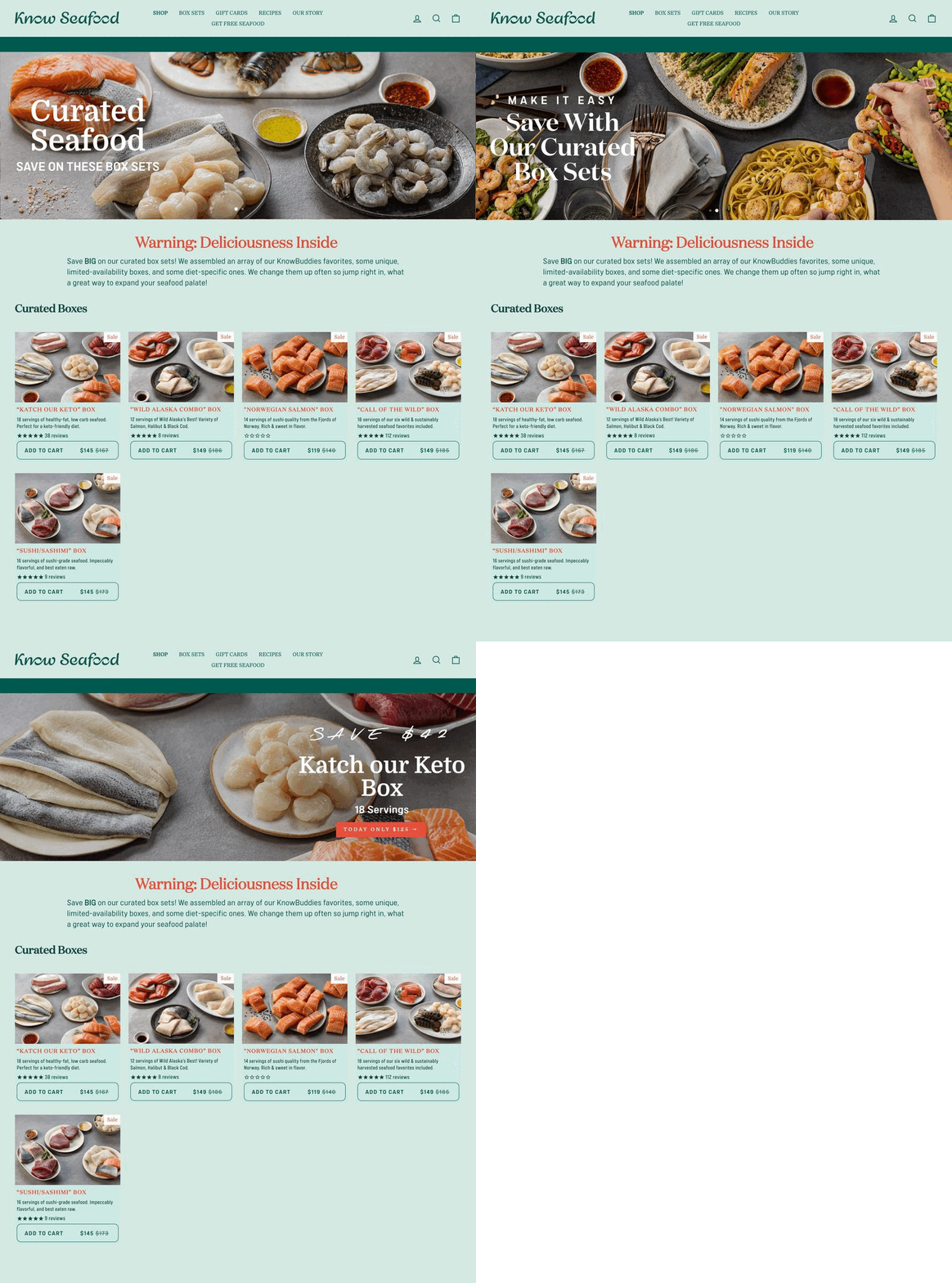
The focus remained on the products with minimal food props accents such as small bowls of condiments, spices, or herbs. Lighting was carefully set up and modified as needed for each shot to emphasize each product’s texture, shape, form, and color and to eliminate shadows in the front. The shots were captured within a medium frame with everything in focus, showcasing the variety of products.
Recipe Shots
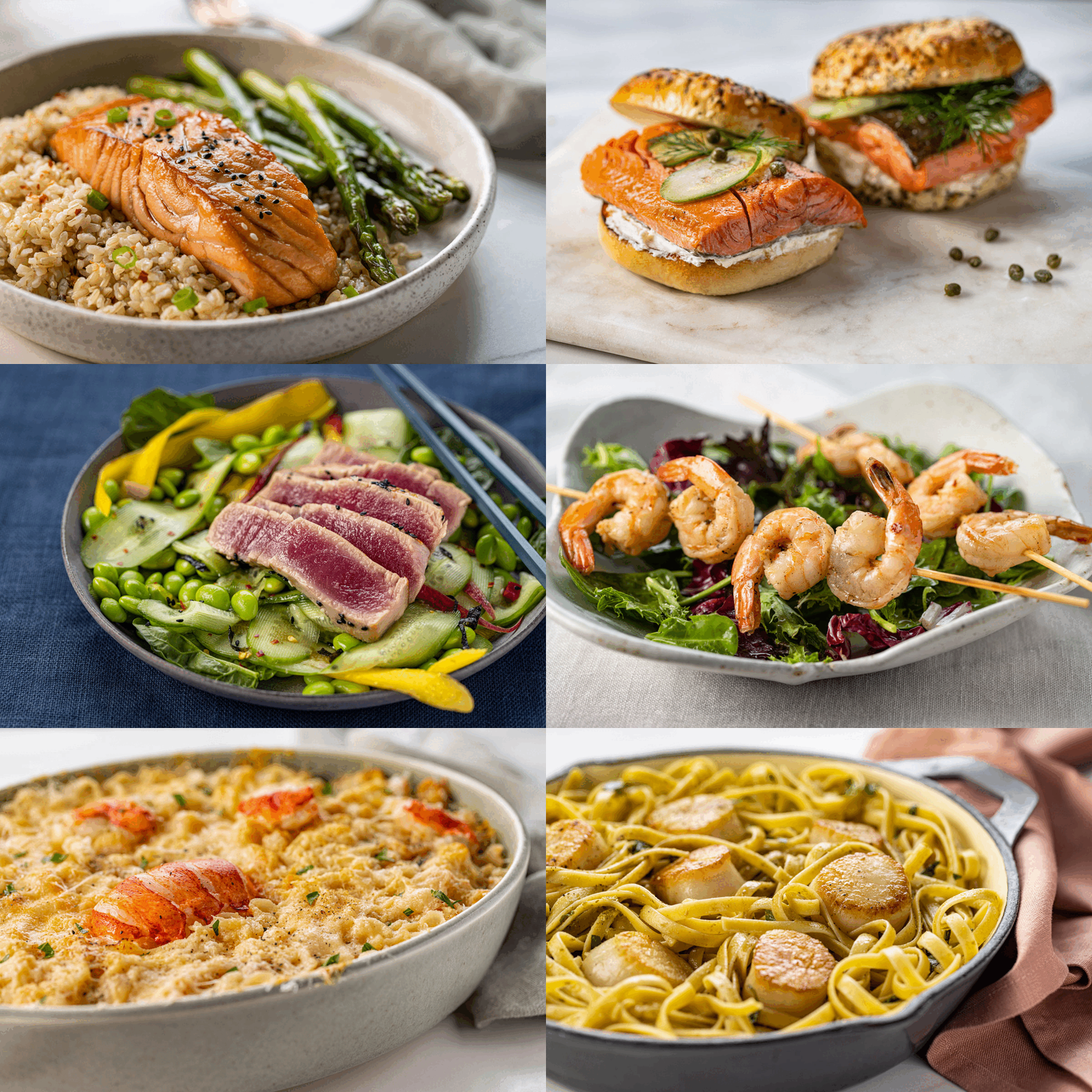
The goal of the recipe shots was to demonstrate that cooking seafood at home can be an enjoyable and uncomplicated experience. The food stylist’s approach was to showcase classic, familiar dishes with simple preparation methods, highlighting the quality, freshness, and deliciousness of the product through close-up shots of the finished dishes.
The shots were captured in a vertical orientation, with a shallow depth of field and the cooked seafood product in focus. Fill cards were employed to bring out the textures.
Our main focus was on showcasing the shape, color, and texture of the seafood product used in each dish. Props such as ceramic and cast iron vessels, napkins, tablecloths, flatware, and were carefully selected to complement the brand’s ocean tones and organic style.
Lifestyle Shots
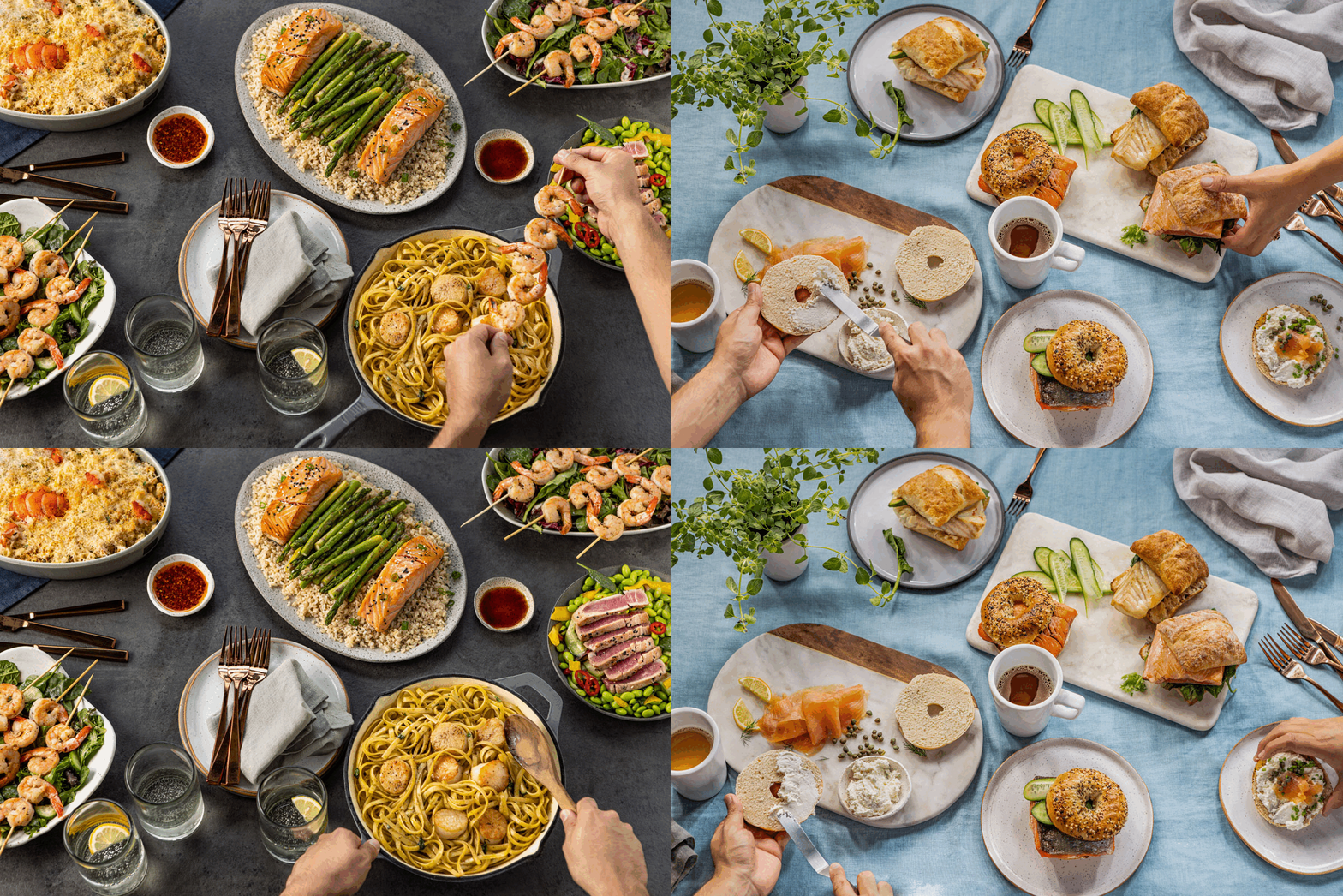
Lifestyle photography seeks to inspire and evoke aspirations. The lifestyle shots were captured by arranging different prepared seafood dishes in two different settings: a buffet-style dinner party and a buffet-style breakfast. The main goal was to showcase the versatility of each seafood product and the various dishes that can be prepared with them.
We included male and female hand models in the shots and used large linen tablecloths and tableware and kitchenware props that complemented the brand’s ocean blue-green tones and highlighted a casual, simple, and healthy dining style.
To capture the tabletop lifestyle and all the prepared dishes, wide-angle shots were taken, keeping everything in focus. Additional lighting and large fill cards were necessary to eliminate shadows and reduce highlights in specific areas.
Producing high-quality seafood branding photography proved to be a challenging and time-intensive undertaking. It necessitated significant logistical planning, pre-production preparation, and extensive creativity. Our objective was to ensure that the end product shots were not only visually impressive but also persuasive to potential customers. It’s possible that due to these difficulties, numerous food companies choose to settle for low-quality overhead shots that lack vibrancy and the intricate details and textures of the food product.
GET in TOUCH!
If you need help with turning unappealing food product images into captivating and convincing ones,


