Letting the Sandwich Shine: Scott Suchman photographs sandwiches for American Way
There’s something incredibly satisfying about a good sandwich. One with the perfect ratio of bread to “filling,” whether it’s peanut butter and jelly or freshly cut lettuce, juicy tomato, and cheddar cheese that’s just sharp enough to make you think: who in the world invented the sandwich?
Okay, maybe you haven’t had that exact thought, but writer and food critic Adam Erace certainly has, and he explored the concept in depth in the travel guide American Way. Accompanying his musings were big, bold, and graphic images by D.C.-based photographer Scott Suchman, which lent each sandwich a curious air.
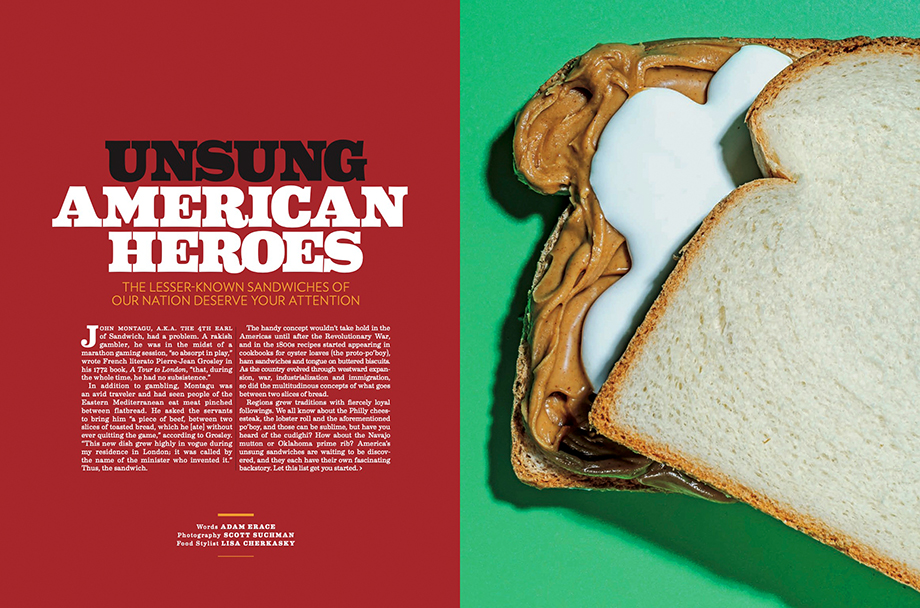
Scott has been working with American Way for years now, averaging a few shoots per year. He’s been specializing in food and restaurant photography for 15 years, so when the magazine needed someone who had connections with food stylists and could put this shoot together quickly and efficiently, they knew who to call.
I shot this along with stylist Lisa Cherkasky, with whom I’ve worked on many projects over the years. The shoot was one day at her home studio in Arlington, VA.
The story was to be centered around lesser-known American sandwiches, titled “Unsung American Heroes.” The art director for American Way requested that each sandwich have a real moment to shine, from the fluffernutter to the lake trout sandwich.
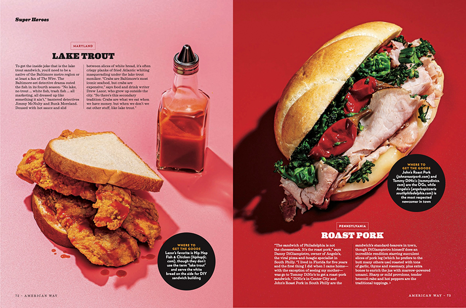
A lake trout sandwich is not trout, and it’s not from a lake. It’s actually fried Atlantic whiting, and it’s great with a lot of hot sauce.
Scott made each sandwich a star, keeping props to an absolute minimum and capturing their textural personalities. He also played with the lighting, making it intense and graphic, letting the backgrounds boost the sandwiches to new heights.
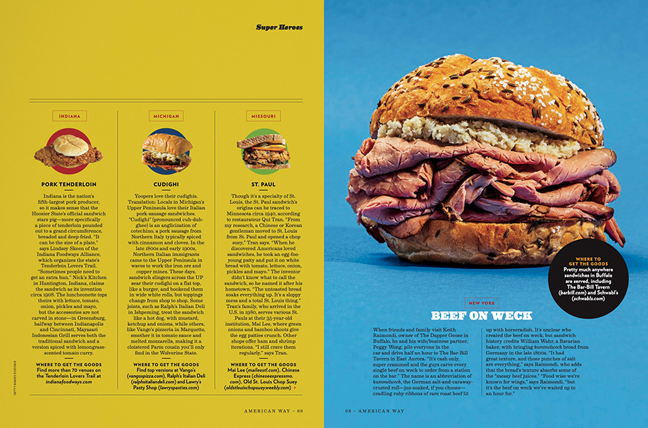
I used colorful vinyl instead of paper backgrounds to give a comic book superhero feel. Vinyl is great because it doesn’t absorb water or pucker, and you can just wipe them clean. It can be a bit reflective, though, so you have to really watch your angles with lights to avoid hot spots.
Luckily, Scott and food stylist Lisa have been working together for years and “play well together in the sandbox.” Their only real hiccup was when dealing with the marshmallow tar fluff.
That stuff has a mind of its own! We must have shot ten different versions of it, but we nailed it a few times, and one became the opener. That version looks like the quintessential 70’s after school snack.
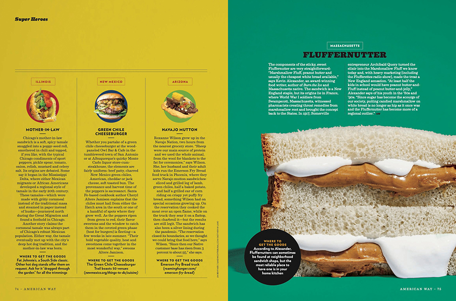
Post-production was relatively minimal, the most notable edit with the pop art-inspired repetition of the Benedictine. Scott and Lisa simply shot three halves of the sandwich in a flying V formation, and American Way made clones to fill a two-page spread. Ultimately, though, Scott was happy to be able to focus on the sandwiches with very little distraction in the frames.
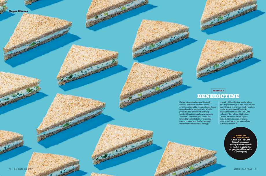
Not having to worry about a lot of propping for the shots made for much more compelling work and concentrated shooting process.
While Scott has a wealth of experience and knowledge when it comes to photographing food, he did learn one thing of note on this shoot.
That marshmallow fluff I hated as a kid? I still hate as an adult.
Credits:
Food Stylist: Lisa Cherkasky
Creative Director: Christos Hannides
Photo Director: Mark Mantegna
See more of Scott’s work at suchmanphoto.com. This article was originally published at wonderfulmachine.com


