Simple Rembrandt Food Photography Lighting Technique Adds Drama to Images of Single Vegetables
Throughout the history of art there are so many great figures of importance who changed the way we visually interpret the world. For photographers, other photographers are not the only source of inspiration. Rembrandt is probably the most famous painter among photographers, thanks to the dramatic lighting used for most of his works. Let’s check out an amazing photographer and her great use of Rembrandt lighting for food photography.
An Art History Great
Rembrandt Harmenszoon van Rijn is the Dutch master of portraits. Considered to be one of the greatest painters in the history of art, his innovation and genius are unanimously accepted. Notable characteristics of his paintings are low-key lighting and austere composition.
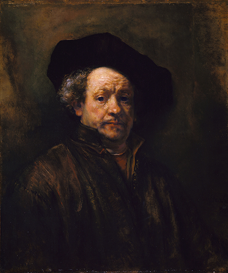
Numerous food photographers revere painters who portrayed light in a unique way such as Caravaggio, Vermeer, and of course Rembrandt. So called “Rembrandt lighting” is a simple lighting setup used in studio portraiture photography. It gives the face a natural, yet quite dramatic look, much like the self-portrait above. Our featured photographer Agata Pec describes further:
“Rembrandt lighting is characterized by an illuminated triangle under the eye of the subject on the less illuminated side of the face”.
This basic setup can be easily achieved using just one light and a reflector. It’s simple but effective. Although Rembrandt lighting in food photography is less commonly referenced than in portraiture, it certainly should be.
How to Use Rembrandt Lighting for Food Photography
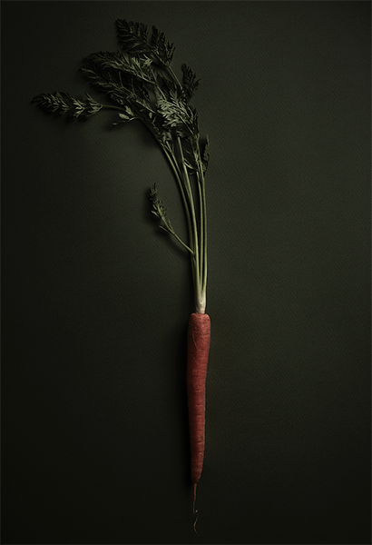
The example above was crafted by Pec, who ingeniously borrowed a tip from the master.
“So how did I pay homage to this great painter? I obviously used his lighting. But not for portraits, well not typical portraits. I used it for food photography. To be more precise I shot vegetables using this lighting technique. This low-key light has the fantastic capacity to enhance the texture and rawness of the subject. What better way to light veggies?”
It is true that the carrot takes on a sort of distinguished look like classic portrait renderings of artists and nobles. The drama of the image is undeniable and as she states the texture is really well rendered.
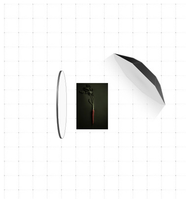
When looking at the carrot, the strongest light source obviously comes from the right. This diagram shows us how a reflector on the left of the food subject bounced a much weaker light back to soften the still deep shadow as to not lose all detail on the other half of the vegetable. The artist has provided some more information on her photo above which comes from this series. The camera used was a Canon 7D with a 50mm lens, the soft box was indeed octagonal and paired with a studio strobe, the reflector white.
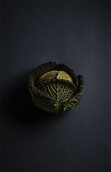
When praising the look of any food photo, never forget the stylist! For these captures the stylist served an important role, selecting the veggies with the best texture at the market. Other tasks included shaving unnecessary leaves, peeling stalks, and arranging the leaves of the cabbage and stems of the carrot.
Try it Yourself!
A lighting technique that only requires one light and one reflector, yet delivers such amazing results, really demands some attention. Although it won’t suit every one of your food photography projects, its potential applications are numerous. Even just having a few images in this dramatic style within your portfolio could really attract the eyes of a future client looking for elegant and emotional shots.
Make sure to check out Agata Pec’s full project in our “Creatives” section. Also, if you have a similar project of your own, we want to see it! You can create a profile on phoode.com and upload it to instantly be visible to many other food photographers and stylists.

