Why is Color Correct Food Photography Important for a Restaurant’s Business?
Restaurants all too often hire random freelance food photographers and publish photos of their dishes with incorrect color balance. As tasty as their food might be, unrealistic or over-saturated colors only destroy its true culinary appeal. Why is being color correct so important in food photography? Because people want to know what food actually looks like. Food just doesn’t appetize when all its intricate tones are bluish or greenish. As a food photographer, it’s your responsibility to get it right. Whether the food photo is for print or Internet use, make sure you are always color correct and never let your restaurant clients down. Luckily there are many tools to help, just read the following strategies.
What Does Color Correct Food Photography Mean?
The idea of “correct color” is a bit subjective. But…not so much. There is a measurable color temperature (in kelvins) that represents the kind of light you are shooting. Imagine a romantic restaurant…you’re facing the person you love, eating fettuccine ever so slowly. Was it candlelit? Perhaps the idea that candlelight is romantic comes from it being very warm light, more flattering than cooler light on skin tones. Each surface will respond differently to different temperatures of light, making color correct food photography potentially tough to achieve.
Although the quality of light can widely vary, the basic designations in photography are: daylight, cloudy, tungsten, fluorescent, and flash. In cloudy skies, objects appear a bit cooler (bluer) than in the sun. Tungsten light is very yellow and warm, while fluorescent lights produce a cool blue effect. The goal in food photography is keeping the colors of your food items unaffected by different lighting situations. It’s not a simple subject. But, there are general rules and numerous tricks to make sure the food you photograph doesn’t look radioactive or caught in one of Picasso’s color phases.
In Camera White Balance for Color Correct Food Photography
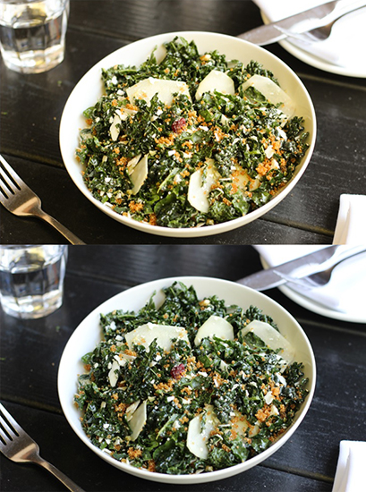
Food comes in all colors. Setting the white balance in camera (as opposed to post-production) is the route many photographers go to capture them all. The salad above looked much worse when shot in auto white balance mode (above), than in fluorescent mode (below). You must know how to change your settings when colors come out like in the first photo above. Arriving appropriately early to a restaurant shoot will give you time to fire off a few test shots, seeing which white balance mode gives the best results. What you shoot, personal preference, how quickly you need to complete the job, and the complexity of the light will determine what method of setting white balance you choose. Color correct food photography starts here, so it is important to understand the entirety of this concept.
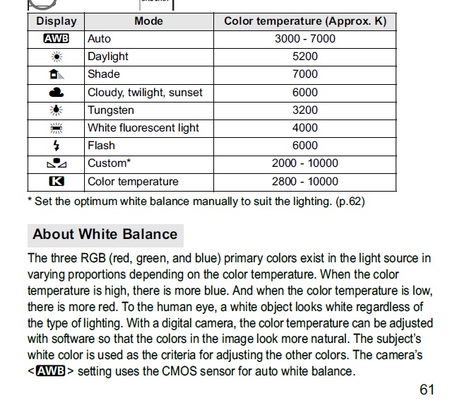
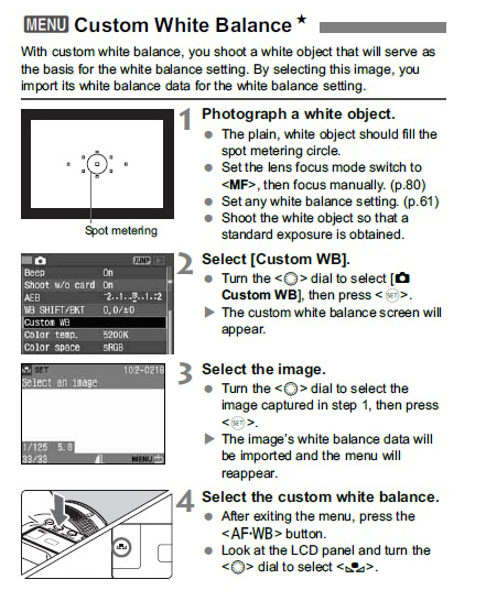
Here is some solid information from a Canon manual. But, considering the unique challenges and goals of a food photographer, selecting a custom white balance is much preferred. Commercial food photographers, working on location without their own lighting, will often find themselves in situations with mixed lighting.
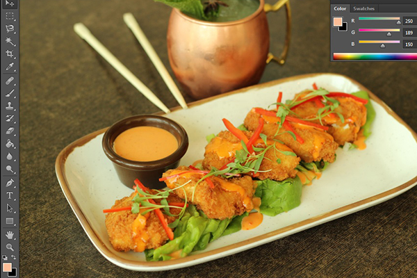
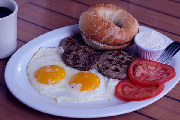
The photo above has white balance issues. It was shot in a restaurant with large sun-filled windows and overhead light, making it tricky to know which preset to select, or complicating information if using auto white balance. Imagine turning in this unappetizing shot to a restaurant, or even worse them actually using it. It would have the potential to kill the reputation of the restaurant forever.
Say you’re in a busy kitchen shooting a chef over a grill with a diffused external flash and there are fluorescent lights overhead. These lighting situations can lead to strange colors in your food photos, the following techniques will simplify them.
Setting Custom White Balance
This can be done by photographing a white card or gray card after selecting PRE (Nikon), or following the instructions above (Canon). Although this may be time-consuming it is probably less time-consuming than correcting each shot in Photoshop. The restaurant business is not an easy one, meaning they need all the help they can get to fight off competition. This tactic for correct colors not only saves you time, but also reassures your client they are working with a high-quality food photographer that will produce the best results. It definitely adds a level of professionalism to arrive with a real white card, gray card, or color target.
After you’ve set the custom white balance for a specific lighting situation, it is not necessary to do so again until your scenario has changed. Although it may seem like a lot to manage, after just a little experimentation this setting should become second nature, just like f-stop, ISO, and shutter speed.
Quick Tip: Problematic Fluorescent Light
Florescent lights cycle. This means the color and brightness the camera will capture can change depending on which split-second of the cycle you shoot. So, you can use a slow shutter-speed, maybe 1/40 that sees a full duration of the cycle. Or, you can fire a few shots on burst fire to cover your bases. Restaurant kitchens often have florescent lights, so it is important to get used to them. Fluorescent bulbs lack magenta, so a camera set to a fluorescent white balance will cover your photo in a green cast to make up for this. Watch out for any kind of color cast and strange effects when shooting under fluorescent lights.
Post-production and Retouching
First things first, shoot RAW format. The ability to change color temperature and set the white balance of each scenario is much easier and faster, without reduction in quality. Batch editing RAW adjustments in Aperture or Lightroom is really easy to learn and will save you so much time, preserving all your precious pixels as well.
Setting White Balance in Lightroom
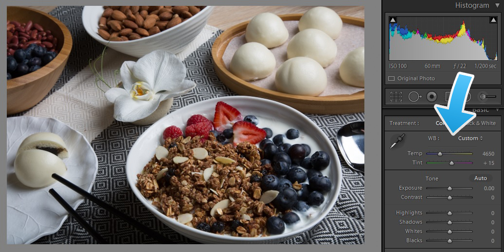
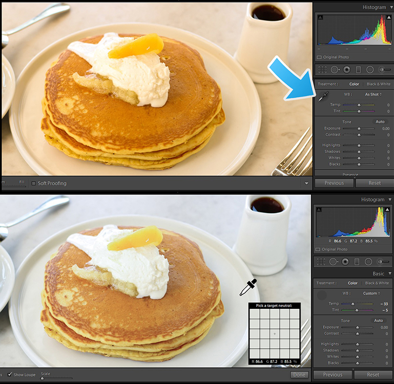
First, we will assume that you are shooting in RAW. There are a few ways of color correcting food photography after the photo has been taken. One option is simply adjusting the color temperature slider in Adobe Lightroom (or equivalent program). If the photo is too warm, slide to the left, or vice-versa (as mentioned in the bowl of granola shot above). For a tutorial with pictures click here.
Another way, is to use the white balance eye dropper tool (pancakes above) to click on something white in the photo to serve as a reference. In this case, a part of the white plate that was neither in shadow nor reflecting a bright highlight gave us a pretty good white balance approximation in just one click! Picture yourself using the first pancake photo on a restaurant’s website or menu; we doubt it would entice half as much as the second. This white balance method is far from foolproof though, still leaving room for error…
Enter the X-Rite ColorChecker!
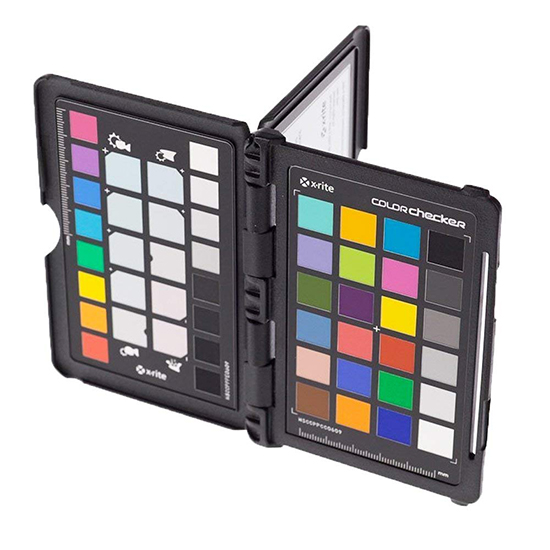
In general a gray card with white, black, and gray patches is considered enough to ensure color fidelity. But, color correct food photography is the goal, so a real tool for the set, like this handy color target package is a great idea. If you want to delve into the subject of color correction and master a photographic topic that is holding back other food photographers right now, this is for you. Just shoot a frame with the ColorChecker present (doesn’t even need to be the whole frame) and in post-production you will have an infallible index of how your camera perceived each color under that specific light. Next, use their easy-to-use Adobe plugin for perfect, accurate colors.
Different colors react differently under the same light. Some light might severely intensify greens, while the blues remain mostly unchanged, thus white balance adjustment is not enough for perfect color. Also, for example, fruit in various stages of ripeness or decay will exhibit subtle color differences you will want to capture. In addition to the classic color target the X-Rite ColorChecker comes with a white balance target and a creative enhancement target for deepening shadows, warming skin tones, and more. It is a very professional tool that may seem intimidating, but is not beyond the level of those only just beginning to edit RAW files.
Color Correcting Food Photography in Photoshop
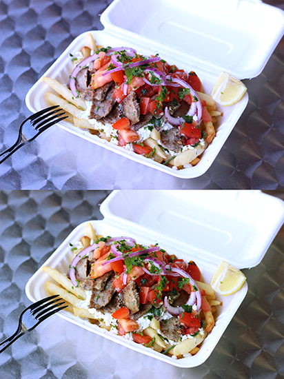
Let’s say you don’t have a RAW file, but just a JPEG. We have corrected the colors of this Mediterranean dish above using this tutorial. When comparing the two photos you can see an overall greater variety of colors in the lower shot and a much more tasty, warm, grilled color of the meat. The method is involved although demonstrates effective results. The key is finding the whitest and blackest part of the photo and assigning these as reference points to balance the color on the “curves adjustment” screen.
If you have some photos that are in focus and might be keepers, do not delete them just yet. With the right editing strategies, even severe color casts are not as big of a problem as one might think.
Quick Tip: Your Monitor and Color Correction
The settings of your monitor also affect the colors of your images. If your monitor is not color correct, you will edit colors in a way that displays oddly on potential restaurant client’s screens. There are basically two methods. First, use the monitor calibration that comes with Windows in the control panel (above). Although the instructions are pretty clear, click here for a full instructions.
The second option is more expensive, yet effective. Using hardware you can calibrate with greater exactitude. Instead of our human eyes determining what color is correct or how bright is too bright, a small device like this one by X-Rite does the work automatically. Although this is extremely easy to use and calibrates your monitor perfectly, we think that a color target like the aforementioned X-Rite ColorChecker would be a much more useful tool.
Your choice of monitor will make a difference as well, some monitors are not able to present near as many colors as others. There are VN, IPS, and VA panels. The most accurate colors are produced by IPS panels, the panel that almost all top-rated monitors for photography use.
Final Thoughts
Color correction is a really fun topic if you enjoy other technical elements of photography such as lighting, exposure, or how lenses function. Considering the amount of time you save trying to correct strange color effects in post-production, mastering color correct food photography is worth it. Sometimes one tricky photo can be quite a speed bump when there are problems beyond white balance or color cast.
Whether consciously or subconsciously the general public does indeed pick up on “off” colors in food photography. Either by criticizing the professionalism of a restaurant, or by the food turning people away, not being color correct certainly has its costs. As for printing, if you are paying for quality prints, seek out a printer willing to advise you on final edits. When using high-quality print shops in person it is not too much to ask for a little free help. Food photography is full of nearly endless technological and conceptual details. It is important to be aware of and address them all, but don’t worry about mastering every single one.
Are you a master of color? Let’s see what you got. All you have to do is sign up at phoode.com and upload your best work. Make yourself visible as a food creative to potential hires and collaborators.

