Sign in
Mexican Food Packaging Design
Published on: November 4th, 2020
Share Project
Focus Area
Creative Style
Unique Skills
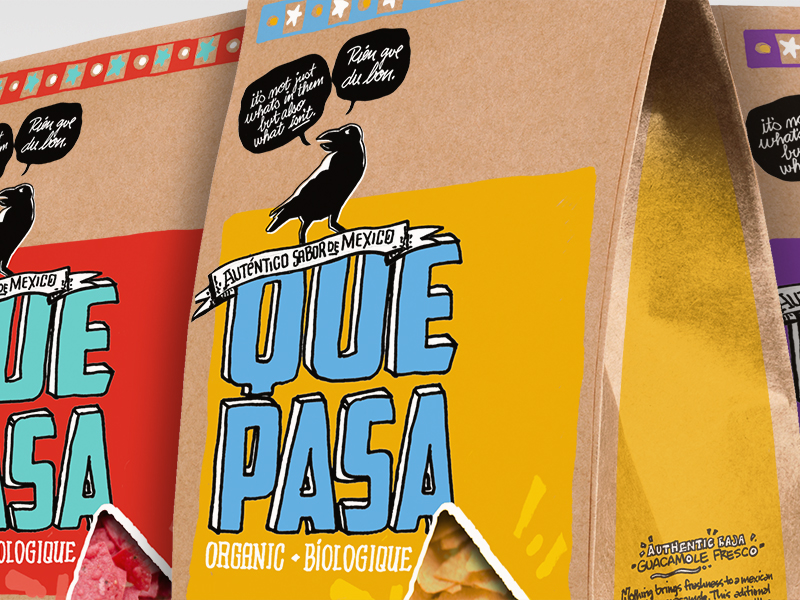
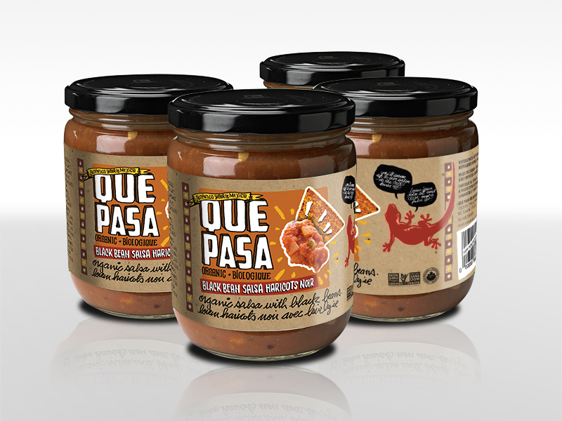
When my employer, Natures Path Foods, bought Que Pasa Mexican foods they wanted to turn the brand entirely organic —like all their other products. The brief was to create a look that supported a Premium Organic Mexican food brand. I chose a kraft packaging background then created unique, hand rendered type, logo and imagery to support a “small batch, artisanal feel” for the brand. Colour cues were made more distinctive and I also created a salsa package that featured a heat-loving gecko. I also created a second design approach that featured a simpler more traditional motif with a scalloped edge yoke, Mexican inspired icons and a custom window. Unfortunately, the designs were not chosen and Nature’s Path opted to go with a Chicago-based design firm for their new look.


Brent's Top Projects
Log In
or
Join Free
to post a comment
There are no comments...
Congrats!
Your project has been successfuly published. Share it with friends to attract more attention to your work and reture to your profile to publish another one.
Back to Profile