Styling Beverages in Postproduction. A Crash Course in Evoking Thirst
Few things are as refreshing or appealing as an ice cold glass of tea or lemonade on a hot day. However, it’s deceptively difficult to get a raw image that looks half as tempting as the real thing.
So, when working with such a simple, ordinary subject, how does a retoucher manage to build something that will make your mouth water? Check out how a few relatively small adjustments can make a world of a difference when it comes to styling beverages.
Add a pop of color
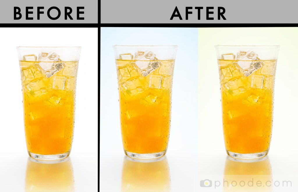
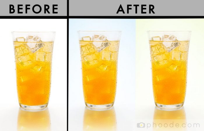
The vibrant yellows and oranges of this drink are hard to miss. However, by adding a contrasting backdrop, it’s possible bring the color of a product. At a quick glance, the contents of the glasses with colored background may seem a bit brighter or more saturated. This is not the case – rather, the cool colors in the background make the warmer shades in this shot all the more evident.
Color of one of the most useful tools a food photographer has at hand to convey something’s flavor. If you wanted viewers to take away that this particular drink tastes like a refreshing lemon or tangerine, bringing in a contrasting color is an effective way of driving home the point. So, while going about styling beverages. don’t forget to think about your surroundings as well as your subject!
Bring in depth and contrast
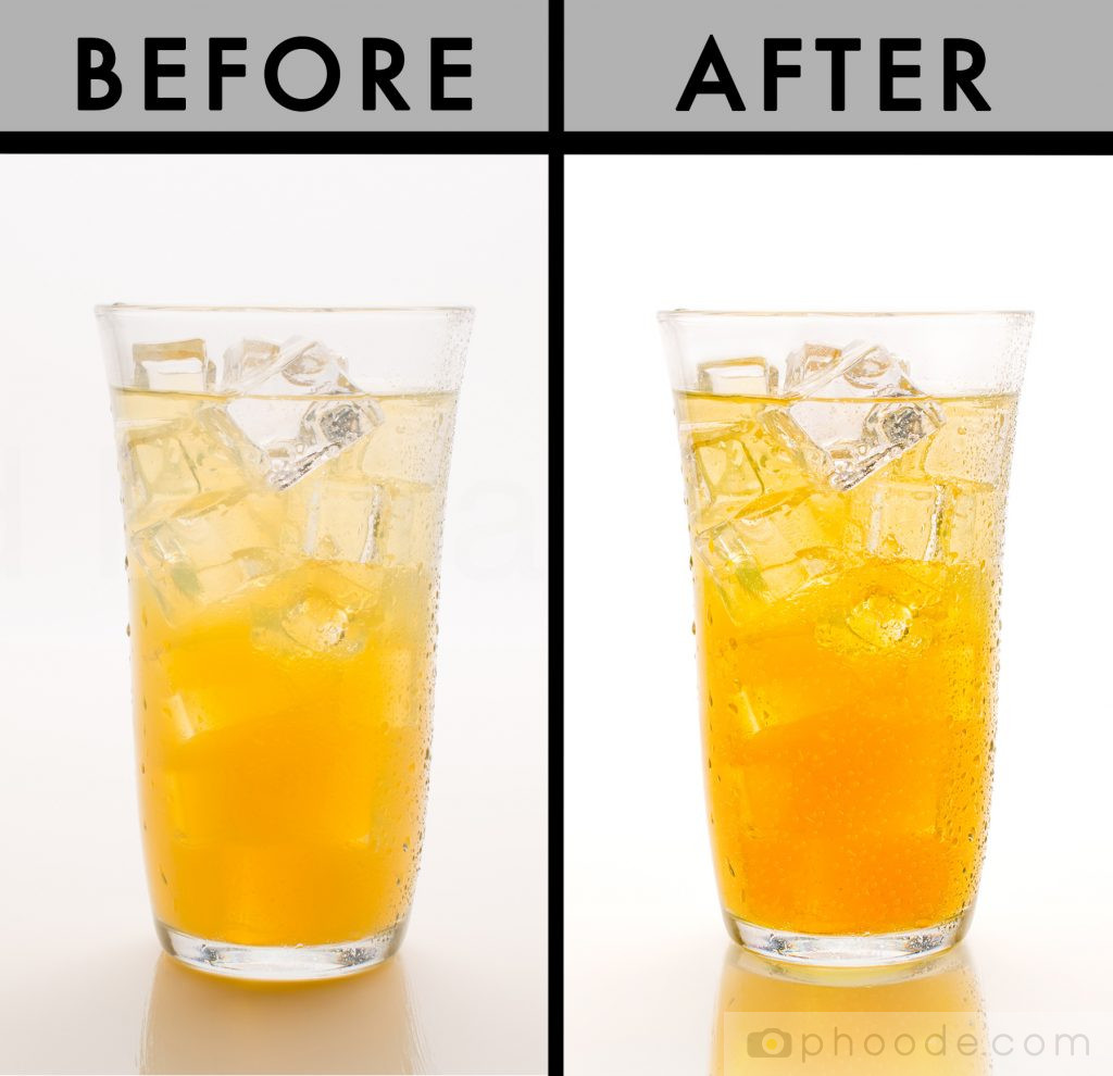
Just about any raw image will benefit from a few tonal adjustments. The camera does a pretty good job of recreating how the human eye sees the world, but it isn’t perfect. There are subtleties that we catch that a machine cannot. Luckily, a little post processing magic can make a shot look better than it would in a real-life scenario.
Although the changes are subtle, most viewers will agree the drink on the left looks a little bit lackluster compared to its Photoshopped neighbor. However, the “superior” image uses elements that are already present in the original file. Notice how exemplifying the highlights and shadows in the glass makes the ice cubes a lot easier to see. Consequently, being able to separate the ice from the glass itself creates more of a three-dimensional feel.
Think about the smallest details
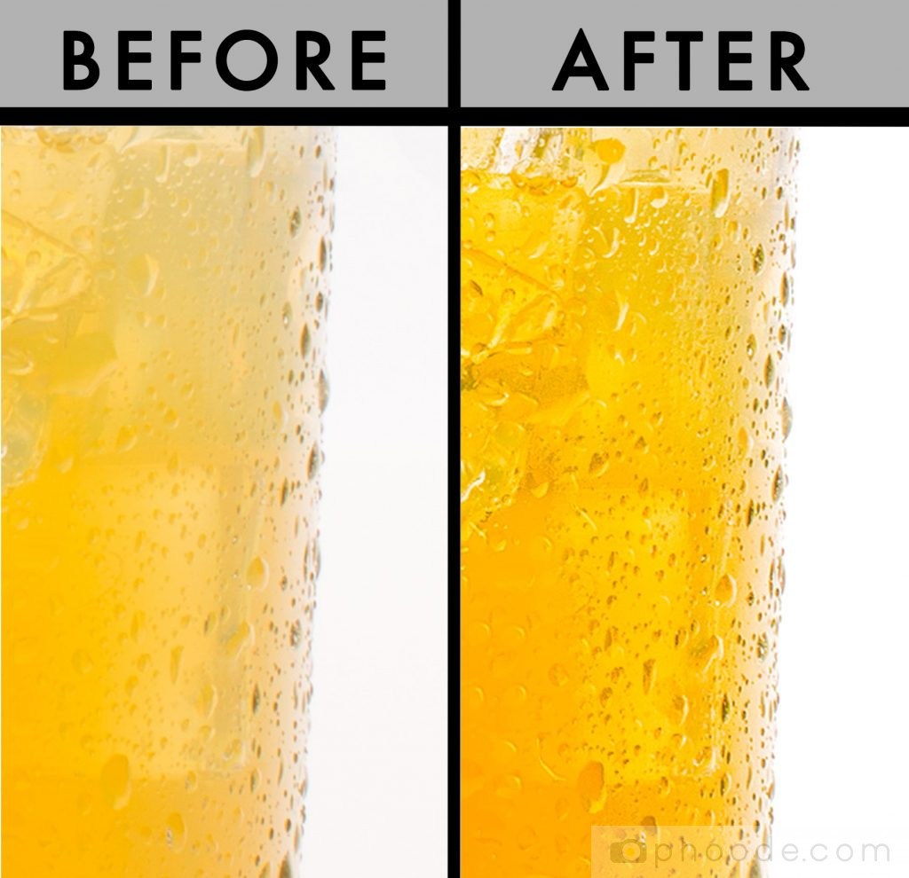
Obviously, we can’t physically feel a photograph. However, a photograph can capture the next best thing – texture. Being able to see the texture of an object allows us to more easily imagine what it would feel like if we were able to reach out and touch it.
The average person might not give a second thought to the condensation on the outside of a glass. But those little droplets provide viewers with information about the product. They illustrate that the contents of the cup are cold, and you can almost feel the wet glass in the palm of your hand. That being said, when you exemplify (or minimize) the smallest elements, you end up with stronger overall end product.
Don’t be afraid to rearrange and manipulate
The main reason that your food and drink doesn’t look as good as advertised is because life isn’t perfect. When styling beverages, there will always be a few elements that are out of even the most careful photographer’s hands. Imaging software, on the other hand, can get us pretty damn close to perfection. When you find something that seems a little off, use the tools at hand to rectify the issue.
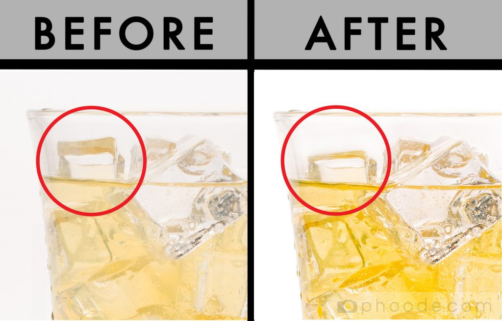
Of course, for the most realistic results possible, it’s best to try and get as much as you can right in camera. But, sometimes that isn’t a possibility. With our drink, there’s one ice cube on the side that juts up and throws off the balance of the image ever so slightly. It may seem like an insignificant issue to some. Nevertheless, by shaving down the cube in post, the drink as a whole gets a little bit closer to being as perfect as it can be.
Would you have tackled this task differently? Do you have any tricks or tips for styling beverages that we didn’t cover? Share your thoughts in the comments!

