Norman Rockwell and the Golden Age of Classic Food Illustration
It’s quite easy to say that illustration in the first half of the 20th century shaped how we see the world today. Hundreds of incredibly talented and determined men and women worked tirelessly to meet the demand for the field brought on by the new wave of industry that was just beginning to take shape.
The early method of Print Advertisement
The increasing need for effective advertisement for thousands of new products and services kept many of these diligent artists busy for many years. Before the 1900’s, the method of reproducing color photography was still in its infancy and publishers had only the means to reproduce simple line art illustrations. Drawings were limited to basic shape and design containing very little, if any, shading or halftones. The images had to be meticulously hand engraved onto plates using time consuming stippling and crosshatching for shading. As the technology advanced in the late 1880’s, a cost effective way to photoengrave images became readily available. Within a decade the process was adapted to produce full color reproductions using the same technique, by separating the image into three plates each with a different color, red, green and blue.
Norman Rockwell, Illustrator
Out of countless artists born into this booming field of print advertising in the 1900’s, a young New Yorker stands out among the many. No doubt you are already familiar with him and his artwork, how could you not be? Rockwell’s paintings and illustrations have come to be, the over the past 100 years, a common vision of American life in the early 20th century.
The era before mass media, color photography, and even television, Norman Rockwell’s visions of play, work and war gave an entire generation of people a picture of simple American lifestyle, images that shaped and inspired all those who saw them. Rockwell began his career by drawing everything he could at a very young age. His early sketches include his everyday activities, his siblings and parents; he even illustrated books while his father read them aloud. He quickly improved his skill attending various schools of art before landing his first professional job at the age of 14. In 1914 at the age of 20 he was made art director of Boys Life, the official magazine of The Boy Scouts of America, a pretty prestigious position for a man of his age.
Illustrating the Great War
The outbreak of WW1 in 1917 put Rockwell on another path. He enlisted in the navy but was so underweight he was deemed unfit for combat. Rockwell’s military service consisted of working for a military magazine while stationed in Charleston NC. From his post, he continued to produce cover art for various private magazines including the one he is most famous for, The Saturday Evening Post, the most circulated magazine at the time. After the war he still continued to paint, never really varying from his established style of drawing, but now living in a post war world his paintings did seem to take on a more patriotic theme. Take a look at some his more unfamiliar pieces and you will notice a common connection, a sense of respect, love and compassion for all peoples mixed with a bit of humor and wit. The strong images portraying the importance of family and togetherness were often accompanied with the image of food, eating or the preparation of a meal
Painting traditions; Family, Food and Togetherness
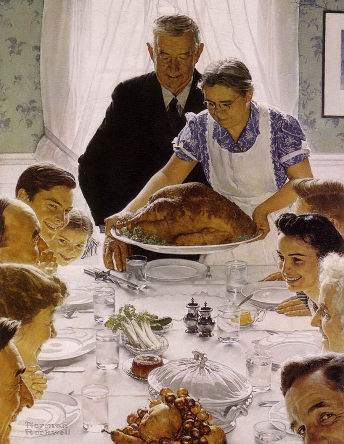
Norman Rockwell definitely had an eye for what joins us as a whole, and although his illustrations cover a range of subjects: patriotism, religion, age, sex, class and food, many of his popular works involve a meal. The one painting involving a meal that stands out the most and is instantly recognizable by most would the painting ‘Freedom from Want’. Painted in 1943, the illustration is one of “the Four Freedoms”, a personal advertising campaign set up by Rockwell for the American War effort to sell bonds. The set of four images was intended to remind us of the basic freedoms America was fighting for. The particular painting, Freedom from Want, portrays the classic Thanksgiving meal at the family home in any town USA.
The simple portrayal of an over abundance of food being served to a happy family was a powerful image especially at a time that this type of meal was a luxury for many Americans.
The symmetrical and centered composition plus the strong lighting of the painting enhances the golden browns of the turkey and the rosy faces of the smiling family. Notice the absence of any color in the place settings and silverware, the sterile look of the table adds even more emphasis on the food itself.
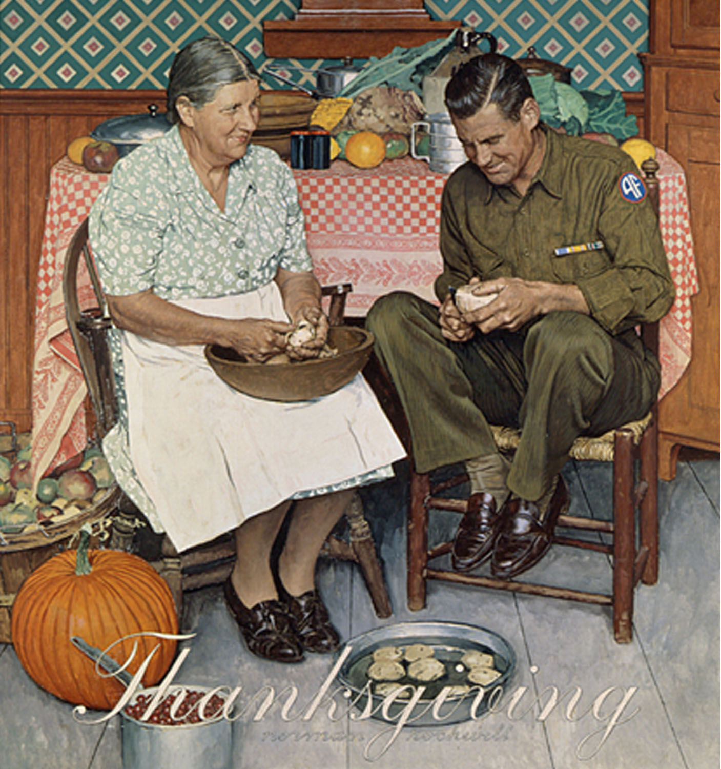
Other works like ‘Home for Thanksgiving’ 1945, also gave a human touch to the effects of a nation exhausted by world war. A simple depiction of a soldier on holiday leave, seen joyfully peeling potatoes with his mother may seem meaningless to an audience today. But in perspective, at the time what would normally be a loathsome task usually reserved as punishment in any military regiment, here he is so delighted to be home he just doesn’t notice.
What’s on the menu?
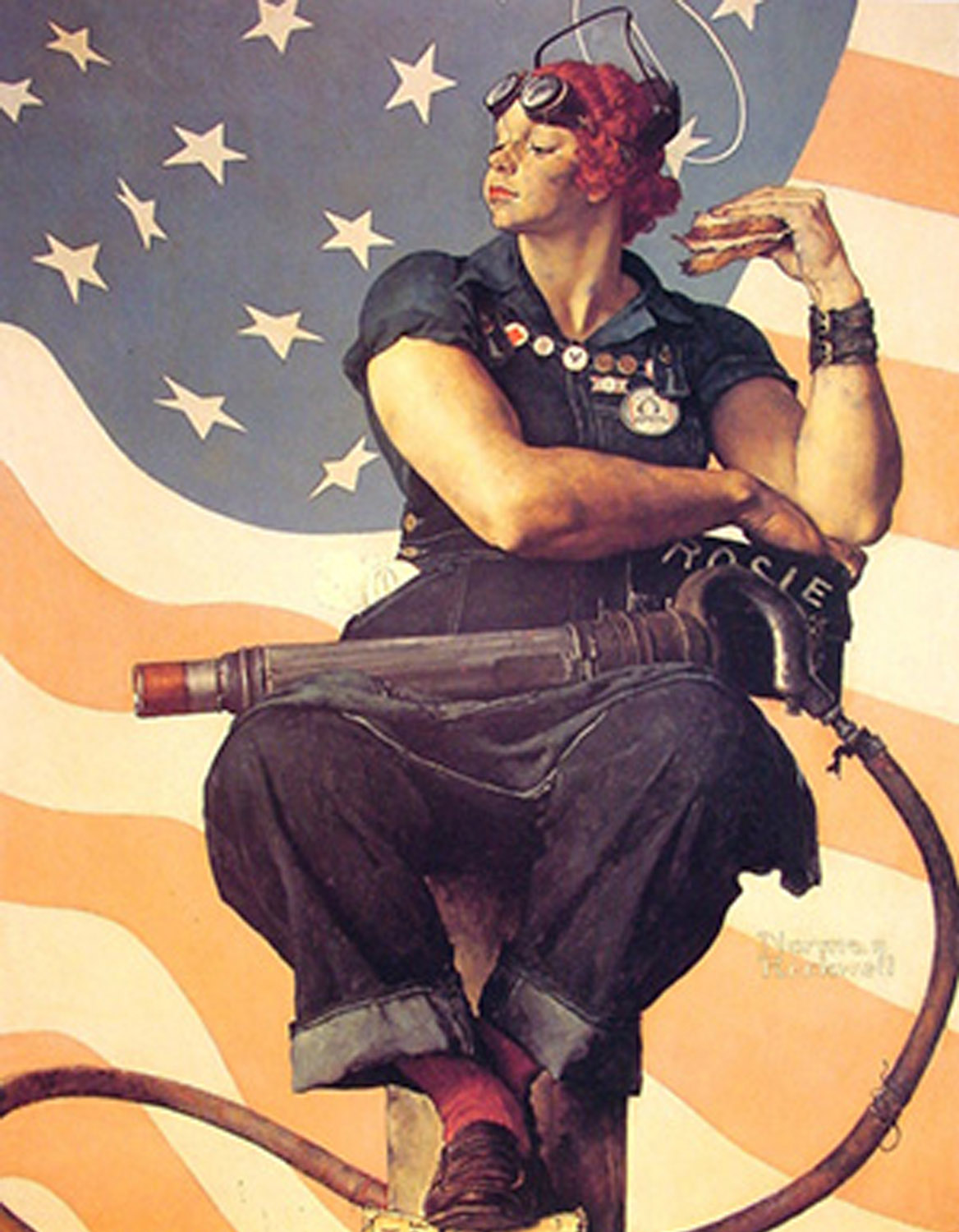
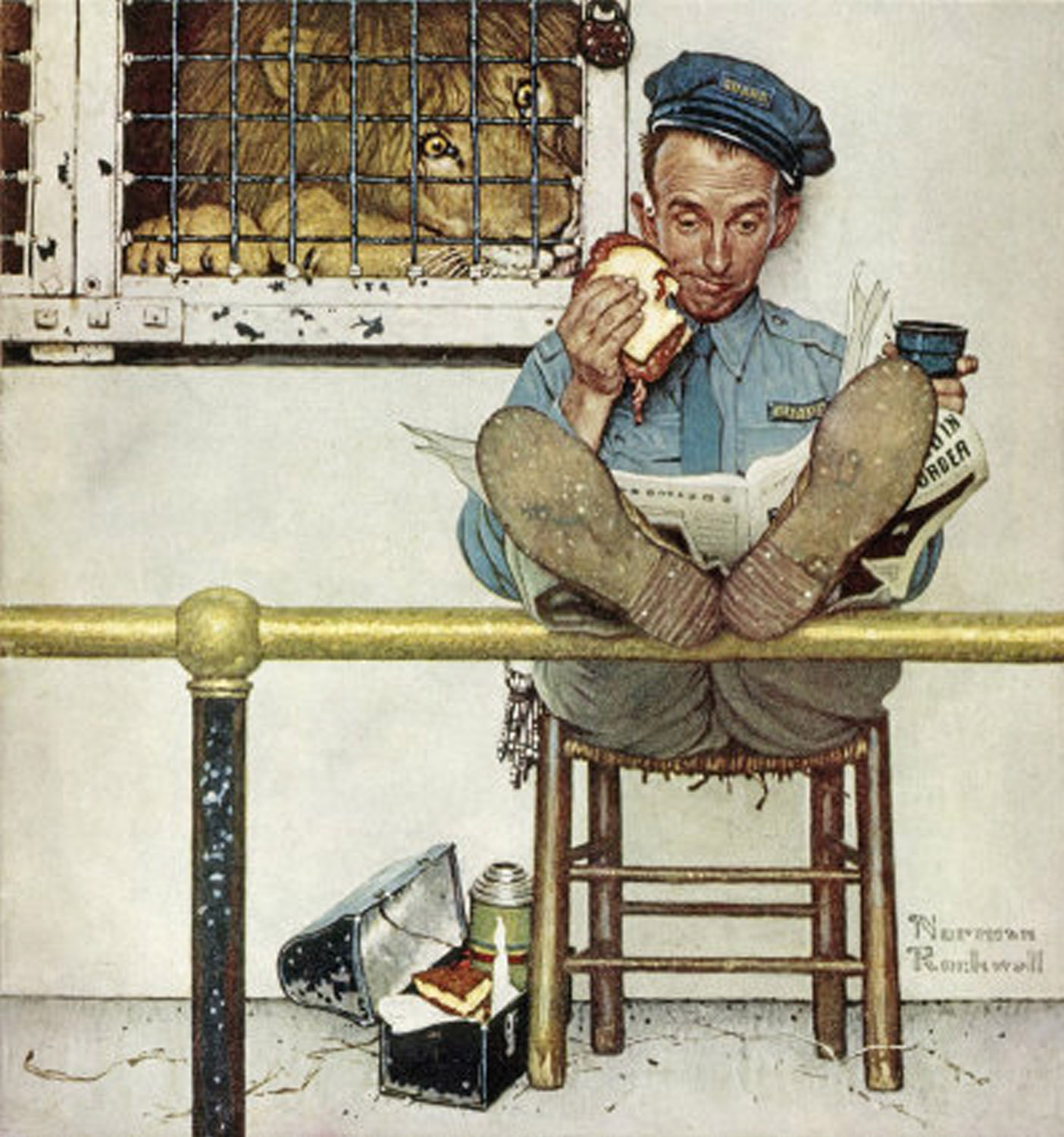
Although Rockwell didn’t center a lot of his paintings around a meal or food, the subject was often included, used mostly as a prop for just a part of a larger image. A couple of melting Ice cream cones in ‘The Ice Cream Carrier’ 1940, A zookeeper eating his lunch near a hungry lion, ‘Lion and his Keeper’ 1954 and Rosie the Riveters ham sandwich 1943 to point out a few. These simple details mostly going unnoticed when compared to his human characters, in the larger image were strategically placed to tell the story he intended to tell or product that was being sold.
The thing that Rockwell was known for was his attention to detail; every part of the painting was significant and had to be perfect in his eyes. This earned him a reputation of being devoted to accuracy and made him a favorite go-to guy for companies’ advertisement campaigns.
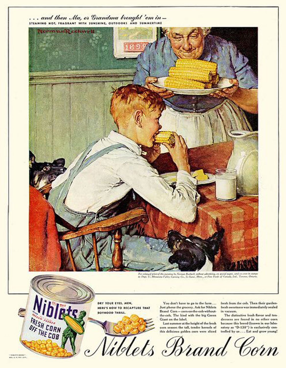
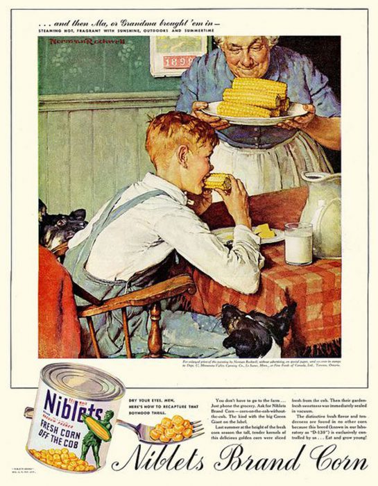
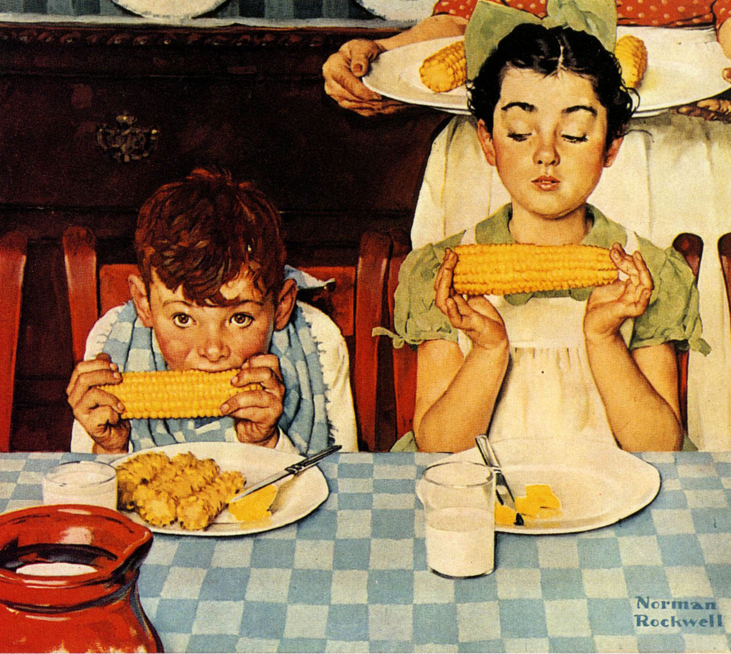
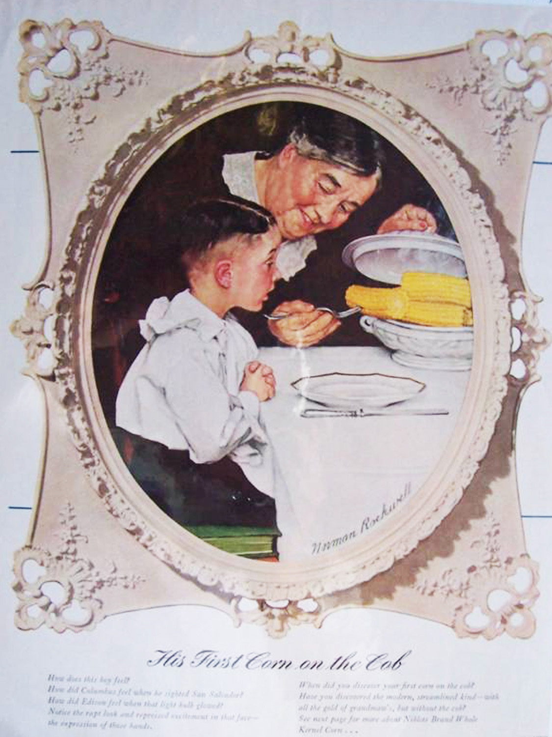
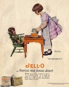
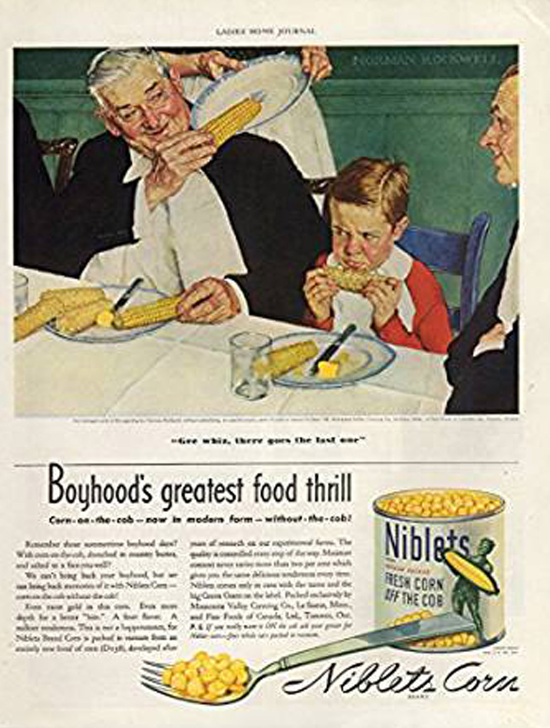
From large to small Rockwell created successful ads for Coca Cola, Green Giant, Jello, Swift Baby food, Orange Crush, and Various Breakfast Cereals. One of his most iconic are the series dedicated to Corn on the Cob without the cob, a series of pieces to sell Niblets canned corn for the Green Giant Co.
His first one titled ‘His First Corn on the Cob’ 1939 featuring Rockwell’s son Peter at 4 1/2 years old. Other Illustrations feature a playful contrast in cob eating techniques, featuring once again his lively and exaggerated freckled faced kids and jolly looking seniors. His broad range of expression and ability to create a picture appealing to many audiences still is used as a model to advertisers today.
Norman Rockwell’s Recipes for Success
Even in Rockwell’s later works, color photography was still rare and expensive. Even then the quality of reproduction was poor at best, so in many cases illustrators like Rockwell were given some artistic license to exaggerate, improving the effectiveness of the images. The amazing technique he was so well known for was his ability to caricature his illustrations without losing realism. His paintings seem to have the look of fantasy but still maintain an anchor in reality. Adding larger eyes, rosier cheeks and emphasizing other facial features like ears, noses and toothy smiles give his characters more life and charm. His ability to do the same with food is equally noticeable; His use of the perfect shade of golden brown on a roasted turkey and arranging blemish free veggies and fruit dazzled the viewer with fantastic expectations of culinary delight.
Theses classic images that emerged during Rockwell’s early career captivated his audience. An audience that was starving for a dose of color in a world filled with dull grey tones brought on by limited printing techniques and decades of war during the darkest eras of the 20th century.
In a time where the world was flooded with an abundance of new and creative designers, ever-increasing publications using new bold and colorful printing, Rockwell’s work stands out among the many. Even today, his unique talent, his use of form, subject and composition, especially adding the element of food and cooking still brings us all together. A subject that connects us all, it transcends all language and borders, culture and heritage.
Inspiration for the generations
Myself, as an illustrator and artist, have always been fascinated by the advertising campaigns of the early 20th century. The bold and bright color pallets and cheerful nature of the subjects seem to drown out the unpleasantness of the world today. The classic look of a simpler time reminds me that the world is indeed a wonderful place, this, especially in todays standards, is what we can all use a little more of. The baking illustration used for this article was one of pieces inspired by these classic images. I chose the subject because of its close association with the Christmas traditions and the memories we all have growing up. The color, style and layout all follow the same formula perfected by those masters of the craft that came before me. I feel honored to be able to pick up where they left off and I can only dream of being as successful as they were.


